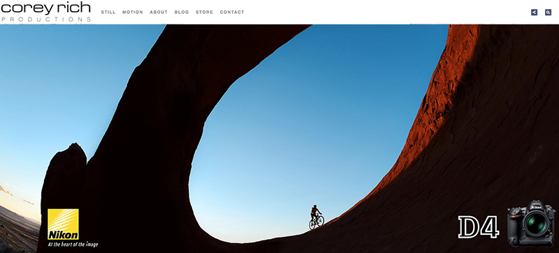
Corey, I’m really enjoying the design and layout of your website. It’s very easy on the eyes, which makes me more inclined to come back here and visit more often. Did you hire out a developer to create your theme? Fantastic work! —Shayne
Thanks for noticing, Shayne!
Websites are inherently complicated and seem as if they will take a lot of energy to maintain. But for freelancers such as myself, websites are also the face of who we are as professionals and people. Therefore, having a great website that represents who you are as a professional and a person is extremely important—not only for marketing and attracting new clients, but for sharing ideas and engaging readers with information, and for just maintaining that all-important online presence.
Last year, I knew my site was overdue for an overhaul. I wanted to create a more modern site, with increased functionality, tools to help me run my business better, easier access points and, above all, something that displayed my latest still and motion work in a gorgeous, jaw-dropping format.
I’m a big fan of keeping it simple. Not that I ever want to cut corners, but there is no reason to reinvent the wheel and spend months of your life and tens of thousands of your dollars building a new website from scratch.
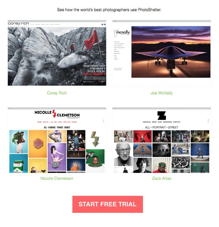
This is one of the many reasons I chose to work with PhotoShelter to help me create my site. PhotoShelter offers a number of templates that you can customize to give you just the right look, feel and functionality necessary for your photography business. I sought out PhotoShelter because they have a track record of excellence and a great reputation in the photography community. Their designs are regarded as being highly professional and very sophisticated. Plus, I know two of the co-founders of PhotoShelter, Allen Murabayashi and Grover Sanschagrin, and I know that anything these two do, they do well.
The design you see on coreyrich.com was created using PhotoShelter’s Beam template, which offers five different “looks” or starting points for design. We chose one we liked, and then continued to work with PhotoShelter to make various modifications to the template to achieve our design and business goals. It has been nearly a year that we’ve been using the Beam platform, and we’re incredibly happy with how our website looks, not to mention the support that PhotoShelter has provided for when we feel like we’re in over our heads.
Any tool that allows me to keep the business side of my life running efficiently and effectively with little extra effort on my part directly translates into me having more time to do what I really love, which is getting out there, getting behind the camera, and shooting pictures.

